2020-07-22
Richard Keech
Kick off
We kicked off in 2019 with a meeting with Luke Middleton onsite at The Cape on a hot and sunny Monday in January. We’d given Luke a written brief already (basically the things in Pt 2, and more). It was great to get the vibe of the site now that the block was complete. Luke went away to produce a concept design. Fun!
Design challenges
We saw the key challenge of the design as reconciling some goals that were in opposition to one another, namely:
- High efficiency vs the need for glazing facing (for the sake of the view) directions which are sub-optimal from an energy point of view;
- Making optimal use of the north light vs privacy from the adjoining public open space to the north;
- Beauty vs affordability.
The Cape design guidelines
It’s worth mentioning that designs at The Cape have to meet a higher bar than the normal state minimum requirements. These higher requirements are expressed in The Cape Design Guidelines which are quite detailed, and capture the high level of aspiration for homes which is key to the vision.
The key mandatory elements of the design guidelines for building and living at The Cape are:
- Mains energy sources: all-electric;
- Thermal performance: minimum 7.5 stars (NATHERS rating);
- Solar PV: at least 2.5kW;
- Rainwater harvesting: at least 10kL of storage;
- No wood-fire heating (see my other blog post about wood heating);
- Residents cannot keep cats because of concerns about their impact on wildlife.
At The Cape, we don’t need to submit to the local Council for planning approval. Instead, the planning approval has been delegated to a design review panel (DRP) let by an architect employed by the developer.
Design concepts
We met with Luke at his office (with Bohemia Hookham, Luke’s talented associate) on 25 January. Luke presented the concept design ideas. We saw four outline concepts. It was great to see the thought processes involved in taking our brief and turning it into a few different alternative concepts, with various pros and cons. The concepts were expressed with diagrams showing zones and sight lines.
It was clear that Luke’s preferred concept was #4. It was ours too.
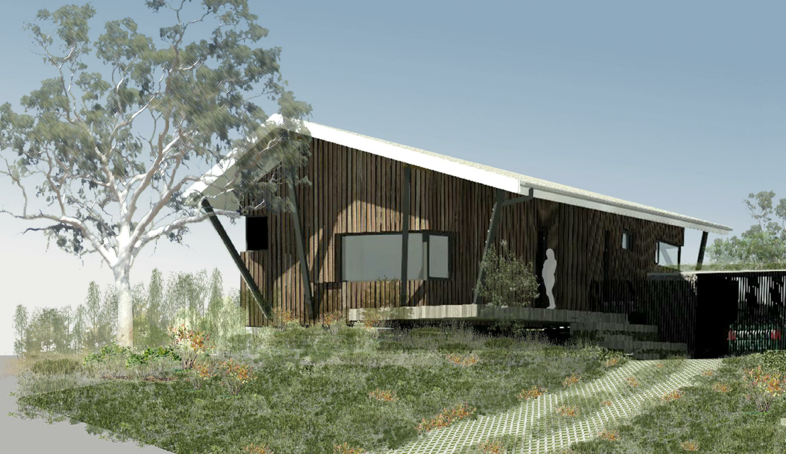
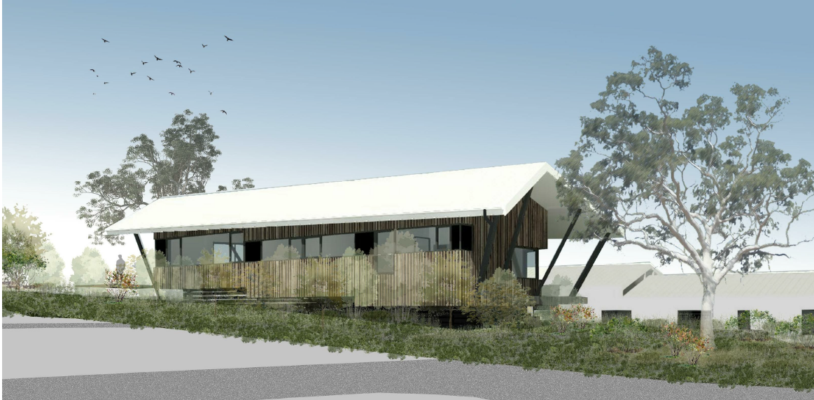
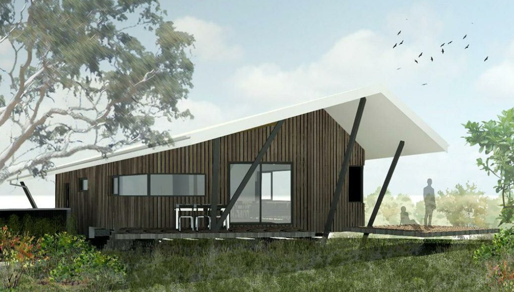
Concept 4’s key elements seemed to be:
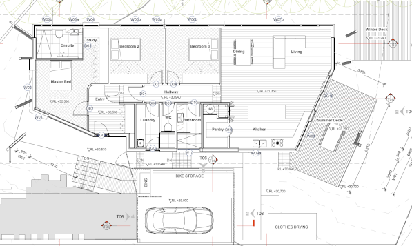
- Simple and compact;
- Timber floor, split over three levels to follow the slope;
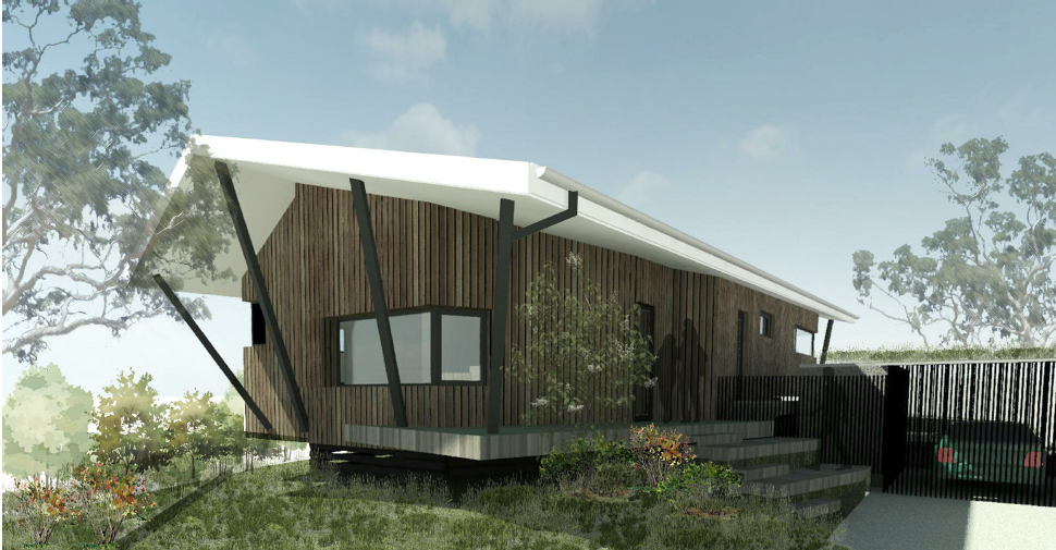
- Dramatic roof structure with sloping ridge line;
- Deep eave extensions at the east and west held down with angled posts;
- Providing covered outdoor space at the east end;
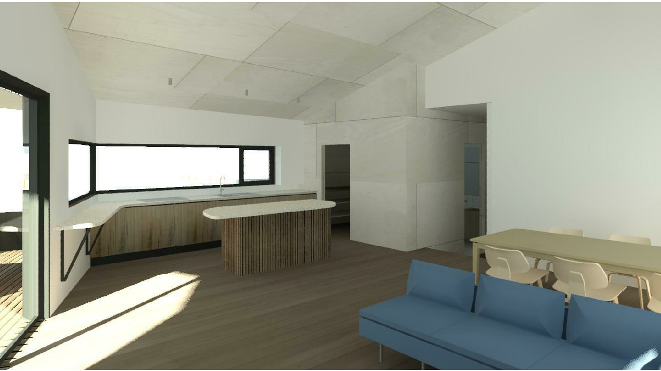
- Ribbon windows across the north;
- Garage kept separate from, and lowered relative to the house;
Garage implications
Having the garage separate from the house and lowered (i.e. dug into the hill a bit) has been done so that it can be looked over easily. This element was surprising and important. It turned the slope of the hill from a problem into an opportunity. It means that from the kitchen and back deck it will greatly expand the sight lines to the horizon. This led to another novel possibility – a green (i.e. planted and living) roof on the garage. More about that later.
Roof
North slope. The roof achieves the goal of having the north face at a steeper angle for better solar panel mounting. However, even though the slope of the north face (34 degrees) wasn’t quite as steep as I’d hoped, it was steeper than most pitched roofs. It should host solar panels really well.
Ridge line. Most houses with a split-level floor arrangement would, in our situation, also have a split-level roof. Instead of that, in our case, the ridge line of the roof is sloped down the line of the hill at 2degrees. This looks really cool.
Posts
A real feature of the design is the angled posts which tie down the gable-end projections of the roof at both ends and at the entrance. It wasn’t clear just how these would be implemented – but they looked really interesting on paper.
Posture
The design is raised slightly off the ground with cantilevered edges at floor level. This gives the home a posture that appears to crouch on or float above, rather that sitting on the landscape. Time would tell how that cantilever would work out.
Outdoor spaces
Luke’s design provides for a summer deck (under the eastern overhang), as well as a winter island deck further north to catch the winter sun. Kate was intrigued with that idea.
Green light
After the presentation of concepts, we quickly gave Luke the green light to proceed to detailed design, and then had to wait to see it all take shape on computer.
The next major milestone down the track was design review panel. So during February and March 2019 there was extensive back and forward between us and Luke and Bohemia, as details were given expression, and arrangements tweaked. It seemed like about every week or two we’d get a new iteration on the design PDF, which would be met with much anticipation.
Passive House
At the first design presentation, Luke put to us that it would be good to make this a certified Passive House (PH). We were comfortable with PH concepts, although we hadn’t seriously considered it for ouselves. Now that it was on the table, Luke convinced us that PH would make a big difference to the comfort and efficiency.
We learned that Luke had tried one other PH project – a renovation in Melbourne. That was for the award-winning Passive Butterfly house in Armadale. The owner of Passive Butterfly, Cameron Munro, kindly agreed to lets us come and see. Their project was very different, being a renovation. But many of the key elements and approach would be the same if we went PH.
We liked what we saw and agreed tentatively for our design to aim to be a certified Passive House.
Cameron’s home (‘Passive Butterfly’) has been open on Sustainable House Day in past years. If you get an opportunity, go and see it.
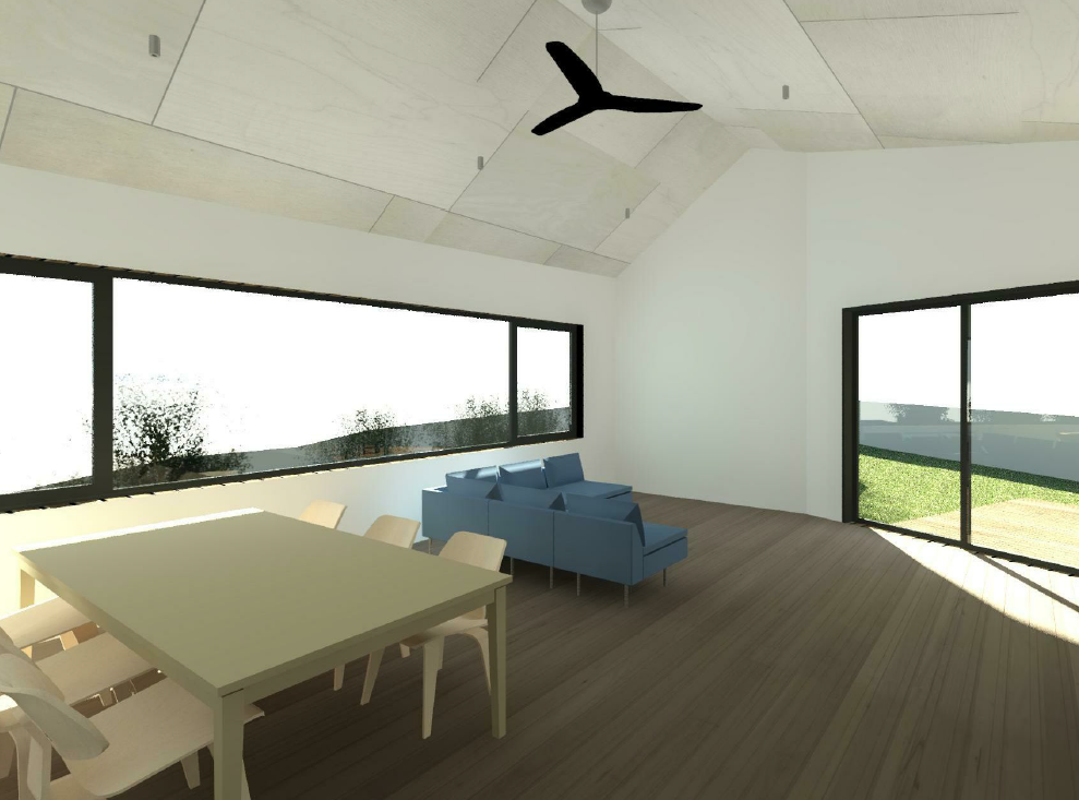
Windows
A big decision with any high-performance home is the windows. We considered many different configurations and makers. It became clear pretty early on that to get a good star rating we were going to need to go with triple glazed. This is because of the amount of south-facing glazing.
There are various window-frame systems. The two main candidates for us were UPVC and timber. For UPVC we liked the look of Ultimate Windows’ ‘Legend’ windows. For timber we liked the look of the aluminium-faced timber frames from both Logikhaus (European-made) and Paarhammer (Australian-made).
All these windows give U values very close to one. This is about three times better (i.e. lower U value) than regular double-glazed windows, and six-times better than common single-glazed windows.
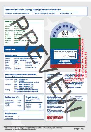
Energy rating
Luke engaged the services of a certified energy rater (‘thermal performance assessor’) – Eoghan Doherty. After agreeing on the levels of insulation, and with a bit of back and forward, the interim star rating came in at 8.1, where 7.5 is the minimum acceptable rating for homes at The Cape.
I say ‘interim’ star rating because the final star rating needs to be issued only on the final construction drawings. We were a long way off getting the building permit.
For reasons that I’ll discuss separately, I think the house will perform a better than this initial star rating would suggest.
Design Review
We submitted the design for review in late February to Adam Dettrick. Adam is the architect retained by the developers to lead the design review process (he’s also behind the Mindil design, mentioned in Pt2). There was some contention about floor levels and potential for overlooking of the neighbours. After some negotiation and compromise, we finally got the DRP go-ahead on 28 May.
A thing of beauty
We are extremely happy with the design. On the affordability vs beauty trade off, I think beauty is winning. At this point we have an approved design, but no real idea what it will cost, and no builder on board. That comes next.